
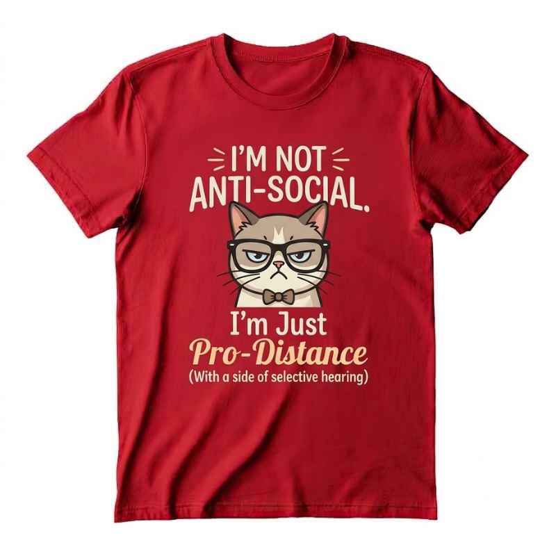
As a designer, I believe the best creative funny t-shirt designs do more than make people laugh. They start conversations, show personality, and give someone a reason to stop scrolling—or compliment a shirt in person.
Funny apparel can be surprisingly difficult to design. A joke may be clever, but if the lettering is hard to read or the artwork feels crowded, the shirt will not have the impact you want. In this guide, I’ll share how I create funny t-shirt concepts that feel original, wearable, and memorable.
What Makes a Funny T-Shirt Design Work?
A successful funny shirt usually communicates its idea within a few seconds. The viewer should not need a long explanation to understand the joke.
When I plan a design, I focus on three essentials:
- A clear visual or message.
- A relatable situation, habit, or personality trait.
- Strong contrast between the artwork and shirt color.
The humor can come from exaggeration, wordplay, irony, a surprising image, or an everyday experience. The most effective designs often make people say, “That is so me.”
Start With a Relatable Idea
Before opening a design program, I write down situations people recognize from daily life. These moments are useful because they already have emotional familiarity.
For example, a funny shirt might be inspired by:
- Coffee dependence.
- Weekend laziness.
- Gardening mistakes.
- Cooking disasters.
- Pet ownership.
- Office life.
- Introvert humor.
- Gym excuses.
- Parenting moments.
- Obsession with books, food, or hobbies.
I try to avoid jokes that are too broad. Instead of designing around “I like coffee,” I might explore a more specific idea, such as someone who cannot answer a question before their first cup.
Specific humor feels more personal, which makes it more likely that the right audience will connect with the shirt.
Use Short, Powerful Copy
Long sentences rarely work well on apparel. A T-shirt is not a blog post; it is a visual message that people see while walking past.
I usually test the text by asking:
- Can someone read it from several feet away?
- Does the main joke appear immediately?
- Can I remove any unnecessary words?
- Does the wording sound natural when spoken aloud?
A short phrase with a strong visual is often better than a paragraph. If the concept needs extra explanation, I simplify the idea or let the artwork carry more of the humor.
Try Familiar Humor Formats
Certain formats are consistently useful when developing funny shirt ideas:
- A pun paired with an unexpected illustration.
- A “before and after” concept.
- A fake warning label.
- A humorous definition.
- A confident statement that clearly is not true.
- A character reacting dramatically to a normal situation.
- A relatable confession.
These formats are not meant to make every design look the same. I use them as starting points, then add a distinctive illustration style, color palette, or point of view.
Choose the Right Typography
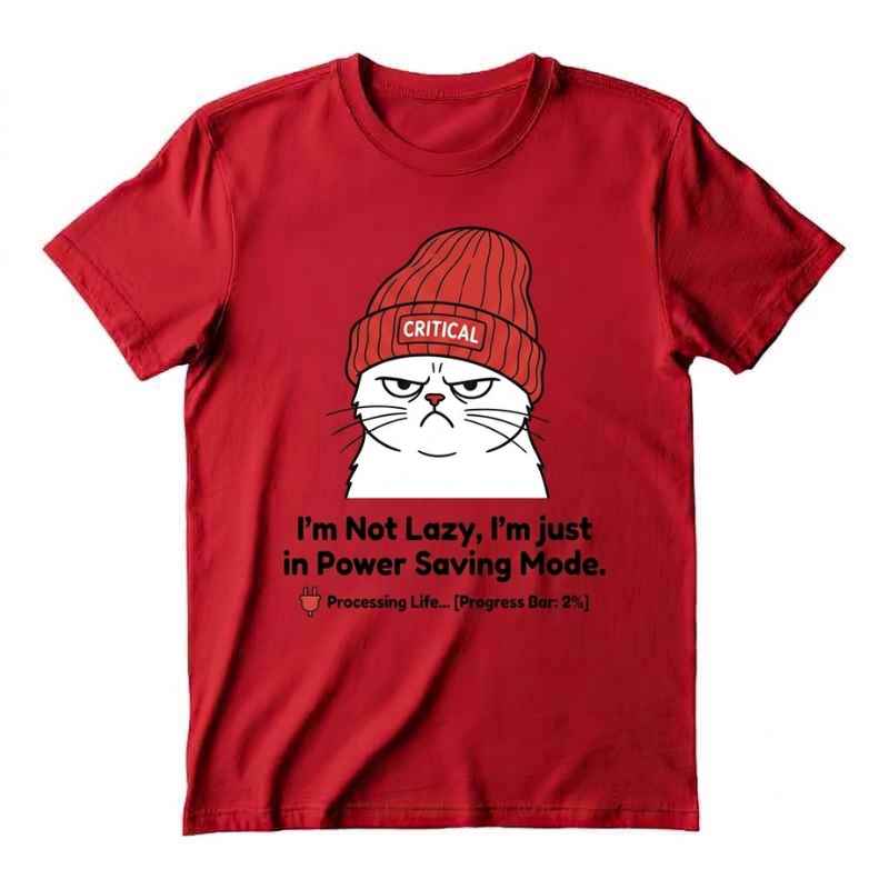
Typography can make or break a funny design. Even a great joke may fail if the letters look too formal, too decorative, or difficult to read.
For casual humor, I may use a bold sans-serif font, a playful hand-lettered style, or a heavy retro typeface. The choice depends on the personality of the joke.
For example:
- Bold block lettering works well for confident statements.
- Rounded fonts can make a design feel friendly.
- Handwritten lettering adds a personal, informal mood.
- Retro fonts are useful for nostalgic humor.
- Condensed fonts can help fit a longer phrase without making it too small.
I also pay close attention to spacing. Tight lettering can feel uncomfortable, while excessive spacing may weaken the message. I adjust the layout until the text feels balanced and easy to scan.
Build a Strong Visual Hierarchy
A funny T-shirt should have one clear focal point. If the viewer sees five equally important elements, the joke becomes difficult to understand.
I normally organize the design in this order:
- Main joke or headline.
- Supporting illustration.
- Small detail or secondary phrase.
This structure guides the viewer’s eye. The primary message creates the first impression, while the supporting details reward people who look more closely.
I also avoid adding decorative elements simply to fill empty space. Empty space can make the design feel cleaner and help the joke stand out.
Match the Artwork to the Humor
The illustration should support the joke rather than compete with it. A simple concept may need only a small icon, while a character-based joke could benefit from an expressive drawing.
Some useful visual directions include:
- Cartoon animals with exaggerated expressions.
- Food illustrations with human personalities.
- Vintage objects and retro badges.
- Simple line drawings.
- Bold mascot-style characters.
- Unexpected combinations of ordinary objects.
- Minimal icons with clever captions.
When I create a humorous character, I focus on posture and facial expression. A tired slouch, raised eyebrow, or dramatic reaction can communicate the tone before the viewer reads the text.
Think About Color and Printing
Color should reinforce the mood of the design. Bright colors can make a joke feel energetic, while muted tones may work better for sarcastic or vintage humor.
I usually begin with a limited palette of two to five colors. A restricted palette can improve readability, control printing costs, and give the design a more intentional appearance.
Before finalizing, I check:
- Whether the artwork contrasts clearly with the shirt.
- Whether small details will remain visible after printing.
- Whether the design still works on light and dark garments.
- Whether the ink colors create the intended mood.
- Whether the artwork looks good in a thumbnail preview.
A design that looks impressive on a large monitor may become unreadable when reduced for an online product listing. I always test it at the approximate size it will appear on the shirt.
Design for a Specific Audience
The strongest funny shirts are usually made for a recognizable group rather than “everyone.” A focused audience gives the humor a clearer direction.
You could design for:
- Cat owners.
- Teachers.
- Bakers.
- Gardeners.
- New parents.
- Graphic designers.
- Nurses.
- Book lovers.
- Gamers.
- People who work from home.
For additional inspiration, I recommend exploring my guide to funny T-shirt design ideas that actually get laughs. It focuses on finding humorous concepts that feel relatable instead of forced.
You can also study how simplicity affects apparel design in my article on aesthetic minimalist T-shirt design. Minimal layouts can be especially effective when the joke depends on timing, contrast, or one carefully chosen phrase.
Avoid Common Design Mistakes
Even experienced designers can make a funny concept less effective through small layout or messaging problems.
Here are mistakes I try to avoid:
- Using too many words.
- Choosing a font that is difficult to read.
- Copying popular jokes too closely.
- Adding unrelated illustrations.
- Using weak contrast.
- Making the artwork too small.
- Explaining the joke with unnecessary text.
- Ignoring how the design looks on an actual shirt.
Originality matters as much as humor. I use familiar experiences as inspiration, but I try to express them through a fresh visual angle or unexpected wording.
It is also important to review designs for cultural sensitivity and unintended meanings. A joke that seems harmless in one context may feel offensive or confusing to another audience.
How I Test a New Concept
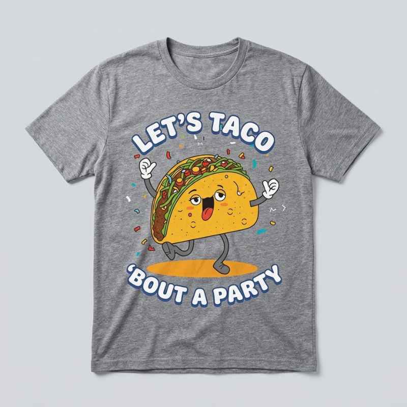
When I finish an initial design, I do not immediately assume it works. I show it at a small size and review it as if I were seeing it for the first time.
I ask myself:
- What do I notice first?
- Do I understand the joke quickly?
- Does the design look wearable?
- Is the humor appropriate for the intended audience?
- Would someone want to photograph or share it?
- Does the artwork still look strong without the product mockup?
If possible, I also ask a few people who match the target audience for honest reactions. Their first response is valuable because it shows whether the joke communicates naturally without my explanation.
Frequently Asked Questions
What are creative funny T-shirt designs?
Creative funny T-shirt designs combine original humor with readable typography and memorable artwork. They often use relatable experiences, clever wordplay, expressive characters, or unexpected visual combinations.
How do I make a funny T-shirt design more original?
Start with a specific audience or everyday situation, then approach it from an unusual angle. Avoid copying common phrases, and personalize the concept through original illustrations, wording, color choices, and typography.
What font is best for a funny T-shirt?
The best font depends on the personality of the joke. Bold sans-serif fonts are easy to read, handwritten fonts feel casual, and retro fonts work well for nostalgic humor. Always prioritize readability over decoration.
How many colors should a funny T-shirt design use?
There is no fixed rule, but a limited palette of two to five colors is often a practical starting point. Fewer colors can improve contrast, make the design cleaner, and simplify production.
What makes a funny T-shirt sell?
A funny T-shirt is more likely to attract buyers when the humor feels relatable, the message is easy to read, and the artwork looks wearable. Designs made for a clear niche often connect more strongly than generic jokes aimed at everyone.
Final Thoughts
Creating funny apparel is not only about writing a clever sentence. It is about combining humor, visual communication, typography, and audience insight in one design that people want to wear.
When I develop creative funny t-shirt designs, I aim for a simple reaction: the viewer understands the idea quickly, smiles naturally, and can imagine wearing it. That balance between humor and good design is what turns an ordinary shirt into a memorable one.
Stay with PrintParkk for creative T-shirt designs and fresh ideas.

