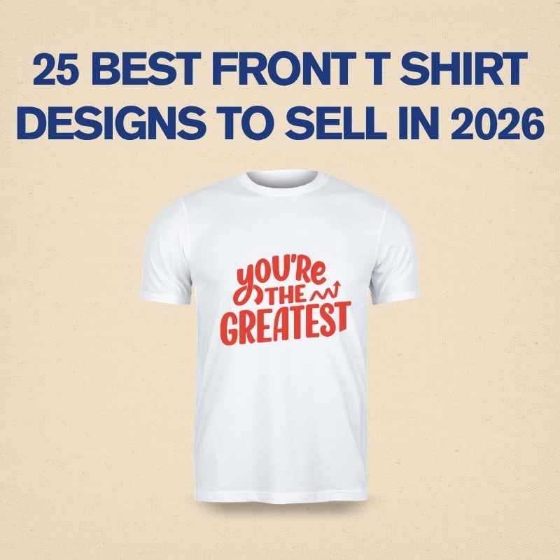

There’s a certain confidence in a design that doesn’t try too hard. While a lot of graphic tees compete for attention with loud colors and busy graphics, aesthetic minimalist t-shirt designs take the opposite approach — and somehow end up standing out even more. A single line, a soft color palette, a small symbol placed just right. It looks effortless, but getting that balance right is actually one of the harder things to do in design.
Here’s what makes this style work, and why it’s become such a popular choice for people who want their clothing to feel calm, intentional, and quietly stylish rather than loud.
Why Minimalism Feels So Intentional
Minimalist design isn’t just “less stuff on the shirt.” It’s about deciding what actually deserves to be there and removing everything else. Every line, every bit of negative space, and every color choice has to earn its place. That level of restraint is what gives minimalist designs their calm, put-together feeling — nothing is fighting for attention, so the eye settles naturally on whatever the designer wanted to highlight.
Negative Space Is Doing Half the Work
One of the biggest secrets behind good minimalist design is how much it relies on empty space. A small graphic centered on a large blank shirt isn’t a lack of effort — it’s a deliberate choice that lets the design breathe. This empty space gives the eye somewhere to rest and makes the actual design element feel more important, almost like a spotlight effect.
Typography That Whispers Instead of Shouts
When text is involved, aesthetic minimalist designs usually lean on clean, thin, or lowercase fonts rather than bold, blocky lettering. A short phrase in a delicate typeface feels personal and understated, which fits the overall vibe much better than heavy, attention-grabbing text would. Spacing between letters (tracking) is often widened slightly too, which adds to that airy, calm feeling.
A Muted, Cohesive Color Palette
Aesthetic minimalist designs rarely use more than two or three colors, and those colors are usually soft, muted, or tonal — think off-white, sage green, dusty blue, or black on cream rather than bright primary colors. This restrained palette is a big part of why minimalist shirts feel wearable with almost anything, since they don’t compete with the rest of an outfit.
Simple Shapes Over Detailed Illustration
Where other styles might lean on intricate illustration, minimalist design usually favors basic geometric shapes, single-line art, or abstract forms. A single curved line suggesting a mountain, or a small circle motif, can carry just as much visual weight as a detailed graphic — sometimes more, because the simplicity makes it feel more thoughtful.
Placement Matters More When There’s Less Going On
With fewer visual elements, placement becomes even more important in minimalist design. A small graphic slightly off-center, or a short line of text placed near the collarbone rather than dead center, can make a huge difference in how “designed” the shirt feels versus how accidental it looks. Minimalist design leaves very little room to hide a placement mistake, which is exactly why it takes a practiced eye to get right.
Bringing It All Together
Aesthetic minimalist t-shirt design proves that a design doesn’t need to be complicated to make an impression. By focusing on negative space, restrained color, quiet typography, and thoughtful placement, a minimalist shirt can feel more considered — and often more premium — than something covered in graphics. It’s a style built on subtraction, not addition, and that’s exactly what makes it timeless.
FAQ
What defines an “aesthetic minimalist” t-shirt design?
It’s a design approach built around simplicity — limited colors, clean typography, and a lot of empty space — where every element on the shirt is intentional rather than decorative filler.
Is minimalist design harder to create than a detailed graphic design?
In some ways, yes. With fewer elements to work with, small mistakes in spacing, placement, or color choice are much more noticeable, so it actually requires a careful, practiced approach.
What colors work best for a minimalist t-shirt design?
Muted, soft tones like off-white, black, sage, beige, and dusty blue tend to work best, since they keep the design feeling calm and easy to pair with other clothing.
Can minimalist designs include illustrations, or just text?
Both work well. Simple line art, small geometric shapes, or abstract symbols fit the minimalist style just as naturally as short typographic phrases.
Why do minimalist t-shirts feel more “premium” than busier designs?
The restraint and negative space often read as more considered and high-end, similar to how minimalist branding or packaging is perceived — it signals confidence rather than needing to fill every inch of space.