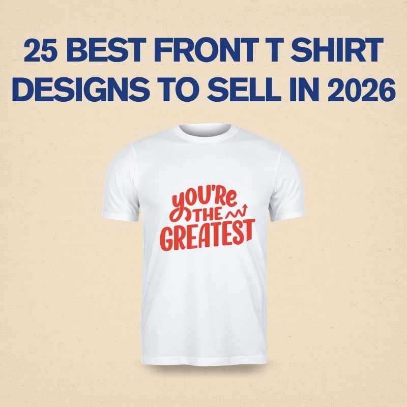

There’s a reason you keep seeing plain text tees everywhere — on your favorite influencer, at the coffee shop, in your own closet probably — and it’s not just a trend that happened by accident. A single word, a short phrase, or an initial set in the right font can carry more weight than a shirt covered in graphics. It sounds almost too simple to be a real design skill, but getting minimalist typography right is honestly harder than it looks. Anyone can slap a sentence on a shirt. Making that sentence actually look intentional is a different story.
The Whole Point Is Restraint
Minimalist typography design lives or dies by what you leave out, not what you add. The instinct when designing anything is often to fill space — add a border, throw in an icon, maybe a small illustration in the corner “just in case.” Good minimalist type design fights that instinct. If a single line of text can carry the whole message, adding anything else usually waters it down instead of strengthening it. This restraint is exactly why the style reads as confident rather than empty.
Font Choice Becomes Everything
When there’s no illustration, no color explosion, no busy background to lean on, the font itself has to do all the emotional work. A thin, elegant serif says something completely different from a chunky, condensed sans-serif — even if the words on the shirt are identical. Some fonts feel calm and editorial, others feel loud and confident even at a small size. Picking the right typeface isn’t a small detail here; it’s basically the entire design decision.
Spacing Is a Design Choice, Not an Afterthought
One thing that separates a genuinely well-designed minimalist tee from an amateur one is how the text sits within the space of the shirt. Letter spacing, line height, and where the text sits on the chest (centered, slightly off-center, small and subtle versus large and dominant) all change how the design feels. Cramped or awkwardly placed text can make even a great font choice look unfinished, while generous, deliberate spacing gives the design room to breathe and feels far more premium.
Color Restraint Reinforces the Message
Minimalist typography designs almost always lean on limited color palettes — often just one ink color against the shirt’s base color. This isn’t a limitation; it’s the point. A single black or white text against a solid shirt color has a quiet confidence that a multi-color print can’t replicate. The contrast between the fabric color and the ink color becomes part of the design itself, not just a technical choice.

The Words Have to Actually Mean Something
Because there’s nowhere to hide behind visuals, the words chosen for a minimalist typography shirt carry more pressure than in a graphic-heavy design. A vague or forgettable phrase falls flat fast when it’s the only thing on the shirt. The strongest minimalist type designs tend to use short, punchy phrases, a personal mantra, a single evocative word, or subtle wit — something that rewards a second glance rather than needing to shout for attention.
It’s Not “Simple” — It’s Edited
People sometimes assume minimalist design is the easy way out, as if less effort went into it. In reality, it usually takes more revisions to strip a design down to its essentials than it does to add more elements. Every choice — the exact font weight, the precise spacing, the placement, the single ink color — has to be deliberate because there’s nothing else on the shirt to distract from a weak decision. That’s the quiet difficulty of minimalist typography design: it hides all its effort.
Bringing It All Together
A great minimalist typography t-shirt isn’t about doing less for the sake of it — it’s about being confident enough in a single idea that it doesn’t need decoration to land. When the font, spacing, color, and words all work together, a simple line of text can feel more personal and more striking than a shirt covered in graphics ever could.
FAQ
Isn’t minimalist typography design easier than illustration-based design?
Not really. With fewer elements to work with, every choice — the font, spacing, and wording — has to be exact, since there’s nothing else to fall back on if one part feels off.
What fonts work best for minimalist t-shirt designs?
It depends on the tone you’re going for. Clean sans-serif fonts tend to feel modern and confident, while serif fonts can feel more editorial or timeless. The key is picking one that matches the mood of the message, not just whatever looks trendy.
Should minimalist designs always use black and white?
No, but they do tend to work best with a limited palette. A single bold ink color against a contrasting shirt color usually reads better than multiple colors competing for attention.
How much text is too much for a minimalist design?
If it stops feeling like a single, quick read, it’s probably too much. Minimalist typography designs usually work best as a short phrase, a word, or a few words at most.
Can minimalist typography designs work for brands, not just personal statements?
Yes, and they’re often a great fit — a clean wordmark or a short brand phrase in well-chosen typography can feel more premium and wearable than a busy logo-heavy design.
Explore the world of T-shirt design with PrintParkk.