

As a designer, I’ve learned that a writing t shirt is one of the most powerful ways to make a statement without using a single illustration. A short phrase, a clever quote, or a bold word can carry personality, humor, confidence, or meaning—all through typography alone.
When I create writing-based T-shirt designs, I’m not just choosing a font and typing words onto a shirt. I’m thinking about rhythm, spacing, contrast, readability, emotion, and how the message will look from across a room. The best text tees feel effortless, but behind every strong design is a series of deliberate decisions.
In this article, I’ll share how I approach writing T-shirt designs, what makes typography tees work, the mistakes I avoid, and how to create designs that feel original rather than generic. If you love minimalist style, bold statements, or clever wordplay, this guide is for you.
Why Writing T Shirt Designs Are So Popular
Writing T-shirts have never really gone out of style. From vintage band tees to modern streetwear slogans, text-based designs remain popular because they communicate instantly.
A person does not need to study the artwork to understand the shirt. They read it, react to it, and often connect with it immediately.
Words Create Instant Connection
A great writing T-shirt can make someone smile, feel understood, or spark a conversation. That emotional reaction is something a decorative graphic cannot always achieve.
When I design a typography tee, I ask myself: What do I want someone to feel when they read this? The answer shapes every decision that follows.
Text Designs Are Timeless
Trends in graphics change quickly. Illustration styles, color palettes, and visual effects can feel dated within a few years.
Strong typography, however, tends to age better. A clean phrase in a well-chosen font can still look relevant years later.
They Work Across Many Niches
Writing T-shirt designs fit almost every niche, including:
- Funny and sarcastic quotes
- Motivational phrases
- Family and parenting humor
- Teacher, nurse, and career designs
- Music, sports, and hobby themes
- Minimalist aesthetic statements
- Retro and vintage-inspired text designs
- Streetwear-style bold typography
That flexibility is one reason I enjoy designing in this category so much.
What Makes a Great Writing T Shirt?
A strong writing T-shirt is more than words on fabric. It needs a clear message, visual balance, and a design that feels intentional.
The Message Comes First
Before I open any design software, I start with the words themselves. If the phrase is weak, no font or layout will fully save it.
The best text tees usually use one of these approaches:
- A short, punchy statement
- A clever twist on a familiar phrase
- A relatable everyday thought
- A bold personal affirmation
- A funny observation
- A nostalgic or vintage-style quote
- A single powerful word
For example, “Coffee First” works because it is simple, relatable, and instantly understandable. Adding ten extra words would usually weaken it.
Typography Sets the Mood
The font is not just decoration. It communicates tone.
A thick, condensed font feels bold and confident. A thin serif can feel elegant or editorial. A handwritten script feels personal and casual. A distressed vintage font can create a retro mood.
When I choose type for a writing T-shirt, I match the font personality to the message. A funny design might use a playful rounded font, while a motivational design might call for strong, clean lettering.
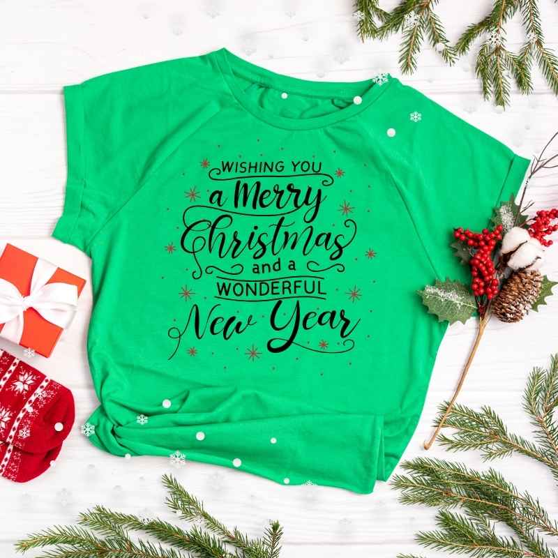
Spacing Makes the Design Feel Professional
Spacing is one of the most overlooked parts of typography design. Letter spacing, line spacing, and margins all affect how polished the shirt looks.
If letters are too tight, the design feels cramped. If they are too loose, it can feel disconnected. I always test the spacing until the text feels balanced and easy to read.
Contrast Improves Readability
A T-shirt is worn on the body, often viewed from a distance. That means contrast matters.
Dark text on a light shirt or light text on a dark shirt usually reads best. I also consider fabric texture, print method, and how colors may appear after washing.
If someone has to squint to read the design, it has already lost.
My Design Process for Writing T Shirt Ideas
Every designer works differently, but here is the process I follow when creating a writing-based T-shirt design.
Step 1: Start With a Clear Concept
I begin by deciding on the theme. Is the shirt meant to be funny, inspiring, sarcastic, cozy, bold, or sentimental?
For example, if I am designing for coffee lovers, I might brainstorm phrases around morning routines, caffeine addiction, or the need for coffee before conversation.
The concept gives the design direction.
Step 2: Write More Phrases Than I Need
I never settle on the first idea. I write a list of possible phrases, even the ones that feel silly or incomplete.
Sometimes the tenth idea is stronger than the first. Other times, combining two rough ideas creates the best final phrase.
A good writing T-shirt often uses:
- Fewer than eight words
- Simple language
- Natural rhythm
- A clear point of view
- A little personality
Step 3: Choose a Typography Style
Once I have the phrase, I test different typefaces. I look for a font that supports the emotion of the words.
For a bold streetwear design, I may use heavy sans-serif letters. For a soft, feminine design, I might choose a script or delicate serif. For a vintage look, I may use a retro display font with slight texture.
I avoid using too many fonts in one design. Usually, one strong font is enough. If I use two, they need a clear reason to exist together.
Step 4: Build the Layout
This is where the design starts to feel real. I experiment with alignment, stacking, curves, and spacing.
Some common layout approaches include:
- Centered stacked text
- Left-aligned editorial text
- Curved text around a shape
- Large word with smaller supporting text
- Vertical typography
- Text arranged in a badge or circle
- Repeated words for rhythm
- A single line placed near the chest
The layout should guide the eye naturally through the message.
Step 5: Refine the Details
After the basic layout is done, I zoom in and clean everything up.
I check:
- Letter spacing
- Line spacing
- Kerning between specific letters
- Alignment
- Margins
- Contrast
- Print size
- Overall balance
This stage may seem small, but it is often the difference between an amateur-looking design and a professional one.
Typography Styles That Work Well for Text Tees
There is no single “best” font for a writing T-shirt. The right choice depends on the message and audience.
Bold Sans-Serif
Bold sans-serif fonts are clean, modern, and highly readable. They work especially well for motivational designs, streetwear, sports themes, and strong statements.
They also print clearly, which makes them a reliable choice for many shirt colors.
Vintage Display Fonts
Vintage fonts bring character and nostalgia. They work well for retro designs, outdoors themes, garage-style graphics, and old-school slogans.
I like using them when the design needs a lived-in, worn, or classic feel.
Script Fonts
Script fonts feel personal, romantic, and expressive. They are popular for family designs, wedding shirts, boutique-style apparel, and feminine aesthetics.
The key is legibility. A beautiful script font is not useful if nobody can read it.
Handwritten Fonts
Handwritten type adds a casual, human touch. It works well for funny quotes, relatable phrases, and designs that feel personal rather than corporate.
Serif Fonts
Serif fonts can make a design feel more refined, editorial, or timeless. They are excellent for minimalist typography tees and aesthetic statement shirts.
If you want a quieter, more premium look, a clean serif can be a great choice.
Common Mistakes I Avoid in Writing T Shirt Designs
I have made plenty of mistakes over the years, and each one taught me something. These are the issues I watch for most carefully.
Using Too Much Text
A T-shirt is not a poster or a book cover. People usually read it in a few seconds.
If the message takes too long to understand, the design loses impact. I try to keep the phrase short and focused.
Choosing Style Over Readability
A font can look amazing on a computer screen but become difficult to read on a shirt. Thin lines, overly decorative letters, and extreme distressing can cause problems in printing.
I always ask: Will this still be readable from several feet away?
Ignoring Shirt Color
The same design can look completely different on black, white, heather gray, or a colored garment. I design with the final shirt color in mind.
For example, a dark navy design may look great on white but disappear on a black tee.
Overusing Effects
Drop shadows, outlines, textures, gradients, and distortion can be useful—but only when they serve the design.
When everything has an effect, nothing stands out. I prefer clean typography with one or two intentional visual details.
Copying Trending Phrases
Trend-based designs can sell quickly, but copying someone else’s exact wording or concept is risky. It can also make a portfolio look generic.
I prefer creating original phrasing or putting a fresh twist on a familiar idea.
Writing T Shirt Design Ideas That Always Perform Well
Over time, I have noticed certain types of text designs consistently connect with people.
Funny Everyday Humor
People love shirts that say what they are thinking. Coffee jokes, introvert humor, parenting chaos, work complaints, and sarcastic comments all perform well because they feel relatable.
The best funny designs do not try too hard. They feel like something a real person would actually say.
Motivational Statements
Short affirmations and confidence-driven phrases work well when they feel genuine. Instead of generic phrases, I try to make the wording more specific or emotionally direct.
A phrase like “Still Growing” can feel more personal than a long motivational paragraph.
Niche and Hobby Designs
Niche audiences love designs that speak directly to their passion. Gardening, fishing, reading, baking, gaming, dogs, cats, and crafting all offer strong opportunities for text-based designs.
A gardening shirt, for instance, might use a playful phrase about dirt, plants, or talking to flowers.
Minimalist Aesthetic Phrases
Minimalist typography has become a major style in modern apparel. A single word or short phrase in clean lettering can look elegant and premium.
This approach works especially well with muted colors, generous spacing, and simple placement. For more on this style, I recommend reading my article on minimalist typography T-shirt design.
Retro and Vintage Slogans
Vintage text designs often use distressed fonts, curved layouts, badges, and muted color palettes. They create a sense of nostalgia even when the phrase is new.
I like this style because it gives a writing T-shirt more visual depth without needing a detailed illustration.
How I Choose Colors for Text-Based T-Shirts
Color can make or break a typography design. Since text is the main visual element, the relationship between the ink and shirt color becomes even more important.
Start With Strong Contrast
My first rule is simple: make sure the words are easy to read.
Black on white, white on black, cream on brown, and navy on light gray are all dependable combinations. High contrast helps the message stand out.
Use Limited Colors
For most writing T-shirts, I prefer one or two ink colors. Too many colors can distract from the words and complicate printing.
A single-color design often looks cleaner and more timeless.
Match Color to the Mood
Color should support the emotion of the phrase.
- Black feels bold and classic
- White feels clean and modern
- Cream feels warm and vintage
- Muted green feels calm and natural
- Red feels energetic and attention-grabbing
- Pastel tones feel soft and aesthetic
I do not choose color randomly. I choose it based on the feeling I want the shirt to create.
Placement: Where the Words Sit Matters
Placement is a huge part of T-shirt design. The same phrase can feel completely different depending on where it appears on the garment.
Center Chest
Center chest is the most common placement because it is balanced and easy to read. It works well for bold statements and classic typography designs.
Upper Chest
A smaller phrase placed near the upper chest can feel subtle and stylish. This placement works well for minimalist designs and brand-style text.
Full Front
A large, full-front design creates maximum impact. It works best with short phrases and strong typography.
Back Design
Back prints are great for longer quotes, brand messaging, or a second design element. I often pair a small front design with a larger back statement.
Sleeve or Pocket Area
Small text on the sleeve or chest pocket area can add a premium, detail-oriented feel. It works especially well for minimalist and streetwear-inspired designs.
Designing for Print: Practical Tips
A beautiful digital design still needs to work in real-world printing. Here are a few things I always keep in mind.
Design at High Resolution
For print quality, I work with vector files whenever possible. Vector artwork scales cleanly without losing sharpness.
If I use raster elements, I make sure they are high resolution enough for the final print size.
Keep Lines Thick Enough
Very thin letters can break down or disappear depending on the printing method. I avoid ultra-thin strokes unless the print method and fabric can support them.
Simplify Distressed Textures
Distressed effects can look great, but heavy texture can reduce readability and create printing challenges. I keep distressing subtle and intentional.
Check the Design at Actual Size
Before finalizing a design, I preview it at the size it will appear on the shirt. A design that looks good zoomed in may feel too small or too large on an actual garment.
How to Make Your Writing T Shirt Designs Original
Originality is one of the biggest challenges in typography design. There are millions of text tees already available, so standing out requires a thoughtful approach.
Use Your Own Voice
I try to write phrases the way real people talk. Natural language often feels more authentic than overly polished marketing language.
Instead of “Coffee Is Essential for Productivity,” something like “Running on Coffee” feels more casual and wearable.
Add a Visual Twist
Even a text-only design can include a subtle visual idea. Words can curve, stack, repeat, or form a shape related to the theme.
For example, the word “RISE” could be arranged upward, or the word “WAVE” could have a gentle curve.
Play With Word Meaning
Puns, double meanings, and clever phrasing make text designs memorable. A good wordplay design gives people a reason to smile.
Keep the Design Honest
I avoid forcing a phrase into a style that does not fit. If the message is calm, the design should feel calm. If it is loud, the typography can be loud too.
Consistency between message and visual style is what makes a design feel believable.
Writing T Shirt Designs for Brands and Small Businesses
Typography tees are not only for personal expression. They are also excellent for brands, events, teams, and small businesses.
Keep Brand Messaging Simple
A brand shirt should be easy to read and instantly recognizable. A short slogan, business name, or simple phrase often works better than a long description.
Use Consistent Fonts
If a business already has brand fonts, I try to incorporate them or choose something similar in tone. Consistency builds recognition.
Design for the Audience
A gym brand, coffee shop, bookstore, and landscaping company should not all use the same typography style. The design should reflect the audience and personality of the business.
Think Beyond the Front
For merchandise, I often design a small front element and a stronger back design. This gives the shirt more value and visual interest.
Minimalism and Writing T Shirt Design
Minimalist writing T-shirts are one of my favorite styles because they prove that restraint can be powerful.
A single phrase, one font, and plenty of empty space can create a design that feels calm, modern, and premium.
The challenge is that minimalism leaves no room to hide. Every spacing decision, font weight, and placement choice becomes more noticeable.
If you enjoy this direction, my article on aesthetic minimalist T-shirt design explores how negative space, muted colors, and simple shapes create a refined look.
How I Test Whether a Typography Design Works
Before I consider a writing T-shirt finished, I run it through a few simple checks.
The Three-Second Test
Can someone understand the message within three seconds? If not, I simplify the design.
The Distance Test
I step back from the screen or view the design in a mockup. Can I still read it clearly from a normal distance?
The Shirt Color Test
I preview the design on multiple shirt colors. A design should not depend on one specific background to work.
The Emotional Test
Does the phrase make me feel something? Even humor counts. If the design feels flat, I go back to the wording.
The Originality Test
I ask whether the design offers a fresh angle. If it feels like something I have seen a hundred times, I revise it.
Tools I Use for Typography T-Shirt Design
I primarily work in Adobe Illustrator and Adobe Photoshop. Illustrator is especially useful for creating clean vector typography, while Photoshop helps with mockups, texture, and presentation.
Other useful tools include:
- Font libraries for typeface exploration
- Mockup templates for realistic previews
- Color palette tools for contrast testing
- Keyword research tools for finding design themes
- Pinterest for visual inspiration and trend research
Tools help, but they do not replace a strong concept. The idea always comes first.
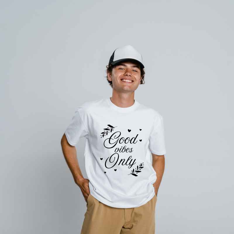
Final Thoughts on Creating Writing T Shirt Designs
A great writing t shirt proves that words can be art. When the phrase, font, spacing, color, and placement all work together, a simple message can become something people want to wear every day.
As a designer, I love typography tees because they challenge me to communicate more with less. There is no detailed illustration to carry the design. The words have to do the work.
If you are creating your own text-based T-shirt designs, start with a strong phrase, choose typography that matches the mood, and refine every spacing detail. Keep the message clear, the layout balanced, and the design honest.
The best writing T-shirts do not shout for attention. They say something worth hearing—and they look good doing it.
FAQ
What is a writing T-shirt design?
A writing T-shirt design is a shirt that uses text, typography, quotes, slogans, or words as the main visual element instead of a detailed illustration. The design relies on font choice, spacing, color, and layout to create impact.
What makes a good writing T-shirt phrase?
A good phrase is short, clear, relatable, and emotionally engaging. It should be easy to read within a few seconds and should match the personality of the person wearing it.
What fonts work best for writing T-shirt designs?
Bold sans-serif fonts work well for modern and motivational designs, while script fonts suit personal or feminine designs. Vintage display fonts are great for retro themes, and clean serif fonts work well for minimalist typography.
How many words should a writing T-shirt have?
Most strong writing T-shirts use one to eight words. Shorter phrases are usually easier to read, more memorable, and more effective as wearable designs.
How do I make my writing T-shirt design look professional?
Use strong contrast, balanced spacing, a readable font, limited colors, and intentional placement. Always preview the design at real shirt size and test it on the final garment color before printing.

